blog
10 Awesome Infographic Ideas & Examples to Inspire You

Infographics are one of the most popular and visually appealing ways to give your audience bite-sized information.
In today’s fast-paced, information-hungry world, concepts are best communicated through the use of charts, visualizations, and sparse text.
Up to 65% of businesses claim to use infographics in their marketing and content strategy.
Sometimes you might need a little inspiration to get your creative juices flowing.
For your convenience, we have compiled a list of 10 infographic ideas.
1. Highlight what goes on behind the scenes
Humans have an innate curiosity about how things are formed, how they function, or what makes them fascinating.
A vital part of a successful brand kit, behind-the-scenes infographics allow you to leverage this natural curiosity by showing your audience how your products and services are made, your company’s history, or your brand’s core values.
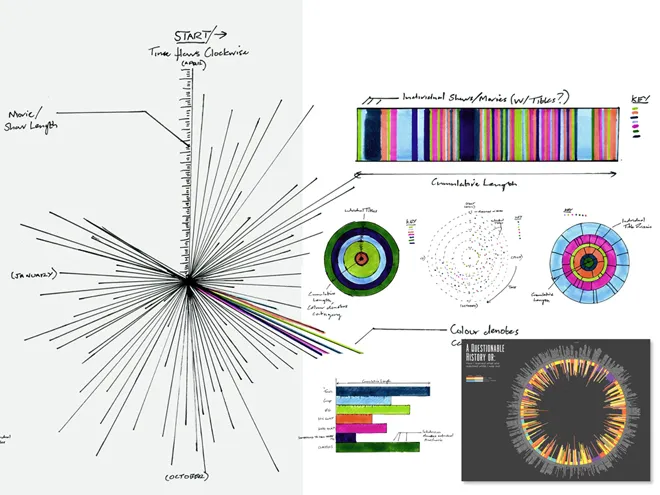
Here is an infographic that provides a great example of organizational structure.
Source: Media Wired
2. Data-driven storytelling
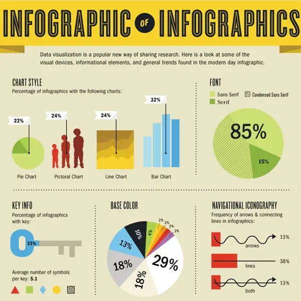
Data-driven storytelling has the potential to increase revenue by 30% and engagement by 300%. Infographic storytelling tells a story using data and a range of visual aids and visualizations. Using carefully chosen charts or diagrams and written annotations, we can illustrate a story’s key points.
They also help in the intuitive delivery of important messages. Explain, for instance, the evolution of e-commerce over the past decade, highlighting key advancements and turning points.
Infographic storytelling can be used for:
- Making complicated data easier
- Educational purposes,
- Commercial presentations
- Research conclusions
Source: Meltwater
3. Comparative Infographics: Visual Shutdown
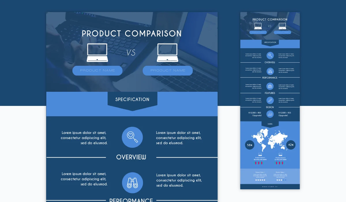
A comparison infographic is a helpful tool for highlighting the similarities and differences between two or more subjects. These infographics help visitors quickly grasp complicated information by graphically illustrating important characteristics, advantages, and disadvantages.
As seen in the template below, arranging competing items side by side can assist users in making an instant decision about which good or service is best for them. Comparable data is connected here, including ratings with ratings and pricing with pricing.
One laptop may be compared to another laptop, one tablet to another tablet, or one smartphone to another smartphone using this infographic.
Source: Visme
4. Feature a map with infographics
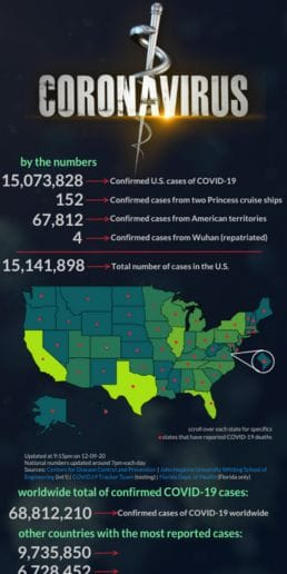
Infographics are more than simply a way to visualize data or processes. You can also display maps, such as those of a town, county, or continent; a map of the body or its systems; a star chart; a map of the weather; or even lines drawn by palm trees.
If you want to highlight and contextualize your data, you can use maps to illustrate any particular text. You can also be as imaginative as you like with your maps because infographics are more about a broad, humorous presentation than precise, minute details. It is not necessary to attain perfect accuracy.
Let’s see in the below example how with the help of maps, COVID-19 cases are shown.
5. Focus on the main benefits
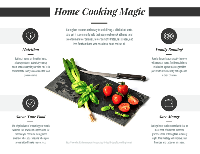
One of the simplest ways to illustrate a product’s value in an infographic is to list its primary benefits. This is true for a wide range of things, including both tangible goods and services.
Let’s have a look at the home cooking infographics below:
Source: Venngage
As this example shows, benefit-based product infographic layouts do not always need to use pictures of the product or a visual depiction of it. Making the infographic longer gives you more room to go into detail about the benefits and features.
6. Busting common myths infographics
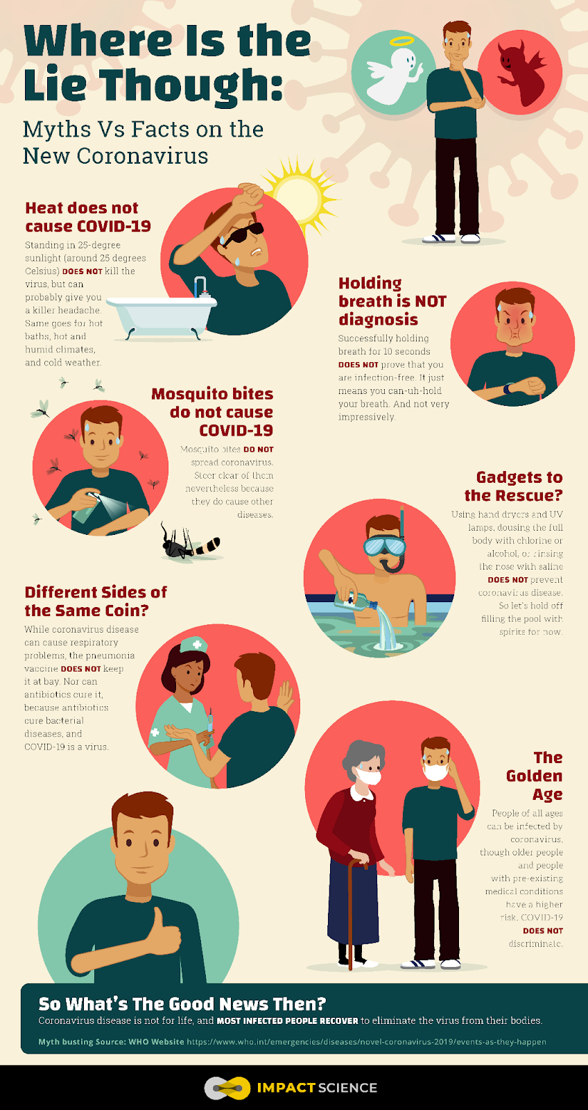
Dispelling myths with hard facts is always fun, but it is much more exciting when done in a visually appealing way. Every time your infographic is shared, it promotes your company and positions you as an authority.
As the COVID-19 epidemic progresses, medical professionals and researchers have been exchanging advice on how to keep social distance and take care of our emotional and physical well-being, among other topics.
We summarized these verified facts about the coronavirus to create this simple infographic.
Source: Cactus Global
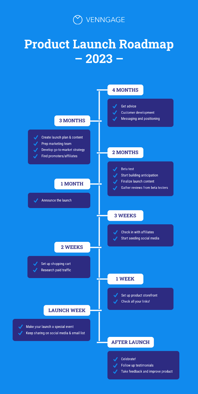
7. Product Launch Roadmap Infographic
Source: AWS
Every infographic you create does not have to be shared with the world; you could use it to assist your team in creating a product roadmap.
This strategy appeals to me as it makes it simple to communicate high-level data and deliverables to the rest of your organization during the project. If required, an idea or topic can be developed further in a different text.
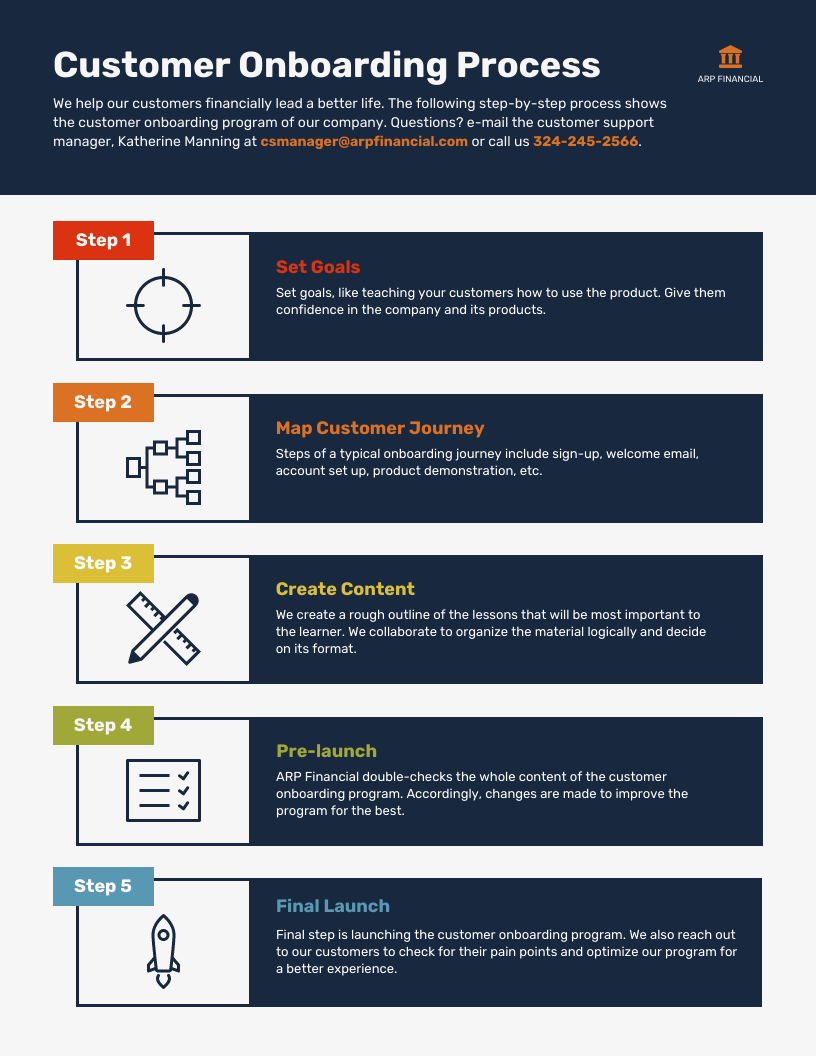
8. Step-by-step tutorial infographics
Source: Venngage
Tutorial infographics are a visual way to break down challenging tasks into manageable steps. Diagrams, images, and text are used to guide customers through a process. People find it simpler to pick up new abilities and finish activities quickly as a result.
Key features
- Avoid technical jargon and speak simply.
- Number each step to make it easier for the viewer to follow along.
- Make use of diagrams, icons, and screenshots to illustrate each stage.
- Call on the audience to try the lesson.
If the process is complex and might be hard for your audience or clients to understand, consider creating an infographic that they can use as a guide.
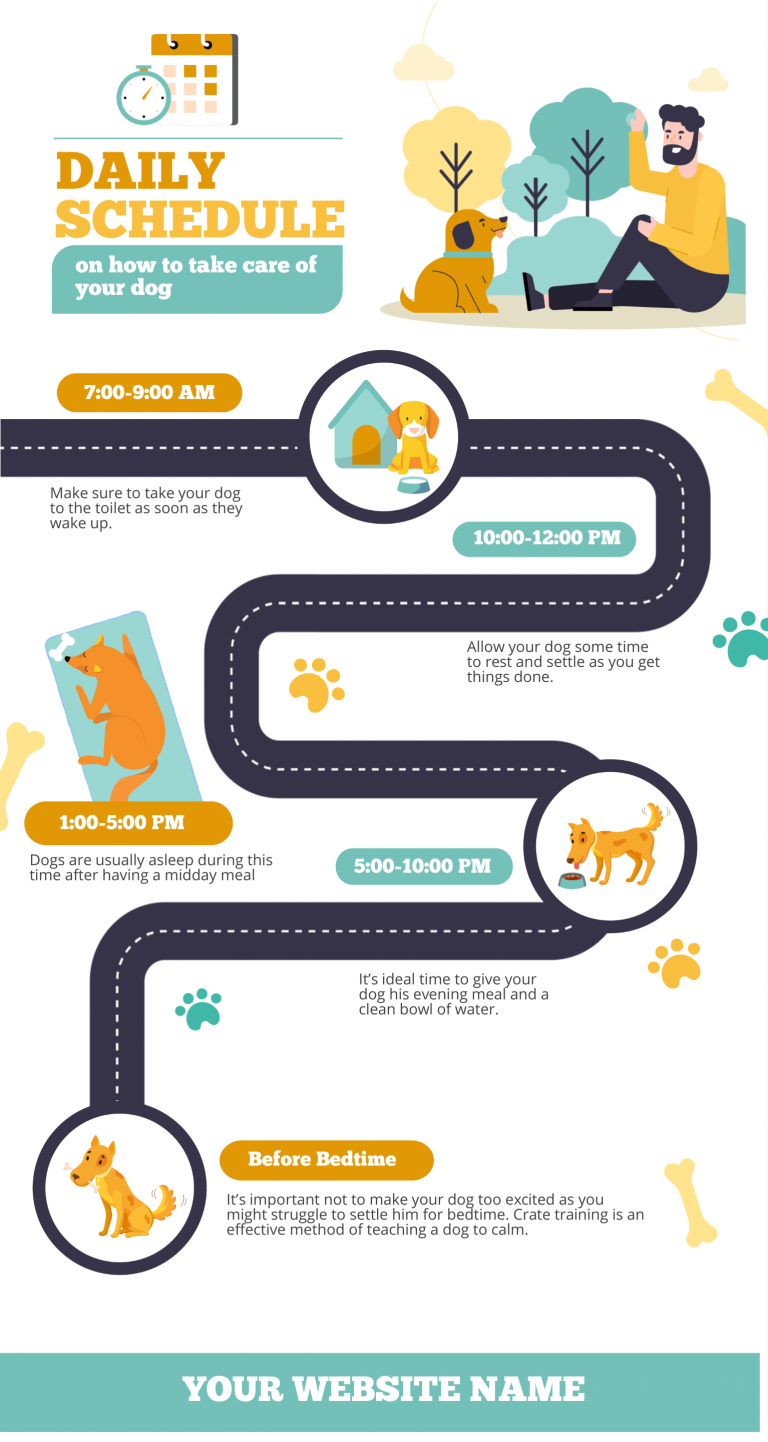
9. Timeline infographics
Use the timeline infographic format to tell a story in chronological order.
Use when:
- Make an intricate, lengthy tale simpler to understand
- Demonstrate how one thing leads to another
- Show how something has evolved over time
For example, you could create a timeline infographic to show how technology has evolved from the invention of the printing press to the rise of artificial intelligence. These significant turning points can be graphically represented to provide a succinct and engaging overview of technical advancements.
Source: Easel
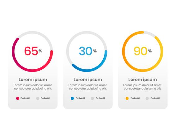
10. Visualize percentage infographic
Pie charts, bar charts, and other charts are common ways to show percentages. Although they are helpful, how can you more creatively present your facts?
In this example, percentages are shown alongside the majority they represent to provide us with more background information and a better understanding of the topic we are studying.
Try experimenting with shapes, symbols, or images when expressing a percentage in your next infographic.
Source: Pinterest
Conclusion
Infographics are a powerful tool for engaging audiences, breaking down complex ideas, and promoting involvement.
infographic design agency can help you create visually appealing images that bolster your brand and help you achieve your marketing goals.
Keep in mind that an effective infographic is a tactical instrument that could propel your business to new heights. It is more than simply a visual assistance.
