blog
Powerpoint Presentation Design: Fonts, Tips, And Best Practices For 2024

PowerPoint presentations (PPTs) are vital for communication and persuasion. Whether you’re pitching to your clients, reporting to stakeholders, or training employees, the design of your presentation can impact its effectiveness.
Fonts, layout, and overall design are no longer just aesthetic choices. They play an important role in conveying professionalism, clarity, and engagement. So, staying updated with the latest practices in a b2b presentation design agency is important for making a strong impression.
By refining your design approach, you can easily create presentations that look great and drive business success.
What Is Power Point Presentation?
A PowerPoint presentation is more than just a collection of slides. It’s a storytelling tool.
Visual Sculptors states, “28.7% of a company’s leadership (C-level executives) report spending five hours or more each week making PowerPoint slides.”
So, PowerPoint is a canvas where creativity meets strategy. It offers designers an opportunity to communicate ideas and data visually.
You (as a designer) can pitch to clients, showcase your portfolio, or present complex information. It provides the flexibility to craft compelling narratives.
PowerPoint Fonts for Your Presentation Design
-
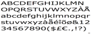
Verdana
Verdana is a clean font designed for readability on screens. Its wide spacing and clear letterforms make text legible when viewed from a distance, making it a popular choice for PowerPoint presentations.
Source: Identifont
- Verdana is ideal for both headings and body text.
- It creates a modern and straightforward look.
- Its versatility allows it to fit well with various design teams
- It is ideal for go-to-font presentations that require clarity and simplicity.
-
Calibri
Callibri is a modern standard in presentation design due to its balanced and contemporary look. It is highly readable even in small sizes, making it perfect for titles and content.
Callibri’s rounded edges and open letterforms make it easy to present slides. It works well in color schemes and layouts, ensuring your presentation feels polished and cohesive. Callibri is a versatile choice for designers looking to blend simplicity and sophistication.
-
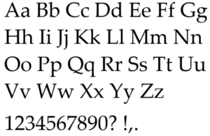
Palatino
Palantino is known for its elegance and readability. It brings a touch of class to your PowerPoint presentations. Palentino is a graceful letterform with a high contrast between thick and thin strokes. This makes it an excellent choice for titles and quotes that require emphasis.
Source: Learn Microsoft
The timeless tool works equally well in art, history, or literature presentations. It adds a touch of sophistication without overwhelming the design.
-
Tahoma
Tahoma is a popular choice for PowerPoint presentations. Its narrow spacing and uniform letterforms make it easy to read at various sizes. The straightforward design of Tahoma allows you to blend seamlessly into any presentation style.
-
Georgia
Georgia is a strong contender for its counterparts in PowerPoint presentations. Its classic and formal appearance makes it suitable for presentations that need a more authoritative tone.
Georgia’s thick strokes and wide letterforms make your text stand out. It’s an excellent choice for titles, quotes, or any text that needs to make a bold statement. Georgia also works well in presentations that blend traditional design with modern elements.
-
Gill Sans
Gill Sans is a touch of personality. It makes them a favorite among designers for PowerPoint presentations. The humanist design gives you a unique and friendly appearance while maintaining professionalism.
These clean and balanced proportions allow you room for easy reading even on large screens.
Tips For Choosing Powerpoint Fonts
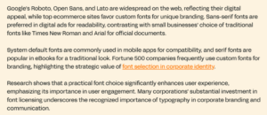
According to Linearity “ More than 50% of Fortune 500 companies use custom fonts for branding.”
Your chosen fonts can impact the overall effectiveness of a PowerPoint presentation. The right fonts can enhance readability and visual appeal and strengthen your message.
Source: Linearity
Here are some key tips to help you select the best fonts for your slides:
-
Stick to Standard Fonts
Standard fonts like Times New Roman, Arial, and Helvetica are reliable for most presentations.
- Serif fonts like Times New Roman have small lines at the ends of strokes, making them more readable for long blocks of text.
- Sans-serif fonts like Arial and Helvetica are cleaner and more modern, often used for headlines and titles.
-
Consider font pairing
Pairing fonts can create a harmonious and visually appealing presentation. Complementary fonts, such as serif and sans-serif, can provide a balanced look.
Similar fonts, like different styles of the same family, can create a cohesive feel. Experiment with different combinations to find the perfect pair for your presentation.
-
Choose the right size
Font size is crucial for readability. To grab attention, headlines should be larger and bolder than body text. Body text should be easy to read, typically between 18 and 24 points. Avoid overly small or large fonts that strain the viewer’s eyes.
-
Create consistency
Consistency is key in a professional presentation. Use the same font throughout your slides to create a unified look. Limiting the number of fonts helps avoid clutter and confusion.
Best Practices for Presentation Design
-
Keep it simple
A simple design ensures your message is clear and easy to understand. Avoid cluttering slides with too much text or multiple images, distracting the audience.
Focus on key points and use white space effectively to create a clean and organized layout.
A minimalist approach helps the audience stay engaged with the content instead of being overwhelmed by visuals.
- Use concise text.
- Focus on one idea per slide.
- Avoid overloading with images and data.
-
Make it easily accessible
Accessibility should be a priority in presentation design. Ensure that text is large enough to be easily read from a distance, and use high-contrast colors for readability.
In addition, alt text for images and diagrams should be included to accommodate visually impaired viewers. Your presentation should be navigable and understandable by everyone in the audience.
- Use readable fonts and colors.
- Provide alt text for images.
- Ensure clarity in visuals and text.
-
Pick your fonts carefully
Fonts play a crucial role in how your presentation is perceived. Choose a professional, easy-to-read, and consistent font throughout your slides. Avoid using too many different fonts, which can make the presentation look disjointed. Stick to a maximum of two complementary fonts—one for headings and one for body text.
- Choose professional and legible fonts.
- Use a maximum of two different fonts.
- Ensure font size is appropriate for readability.
Conclusion
Booking a call with our presentation design agency is your first step toward transforming your presentations into powerful visual stories. With a team of expert designers, we create customized, impactful presentations that resonate with your audience and elevate your brand.
We understand the nuances of design and communication, ensuring your message is delivered with clarity and creativity.
Don’t settle for ordinary slides. Experience the difference that professional design can make. Book a call today to see why we are a step above the rest.